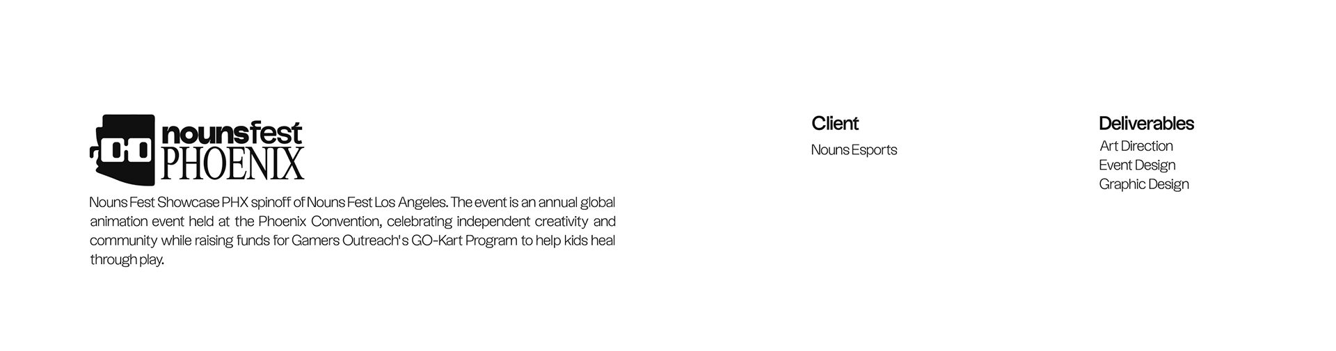
When I joined Nouns Esports in July 2024, I have always been fascinated by their branding and have wanted to create a project using their branding.
This assignment for ADV-355 Image Creation gave me the opportunity to go back and further dive into this brand even more.

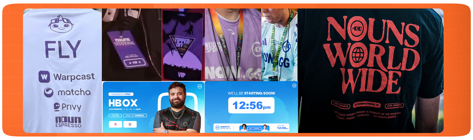
When researching what assets to use for this event, I wanted to make sure it was the same if not similar to what Noun's is already doing. Below is an assortment of images gathered to help further explore the Nouns branding.

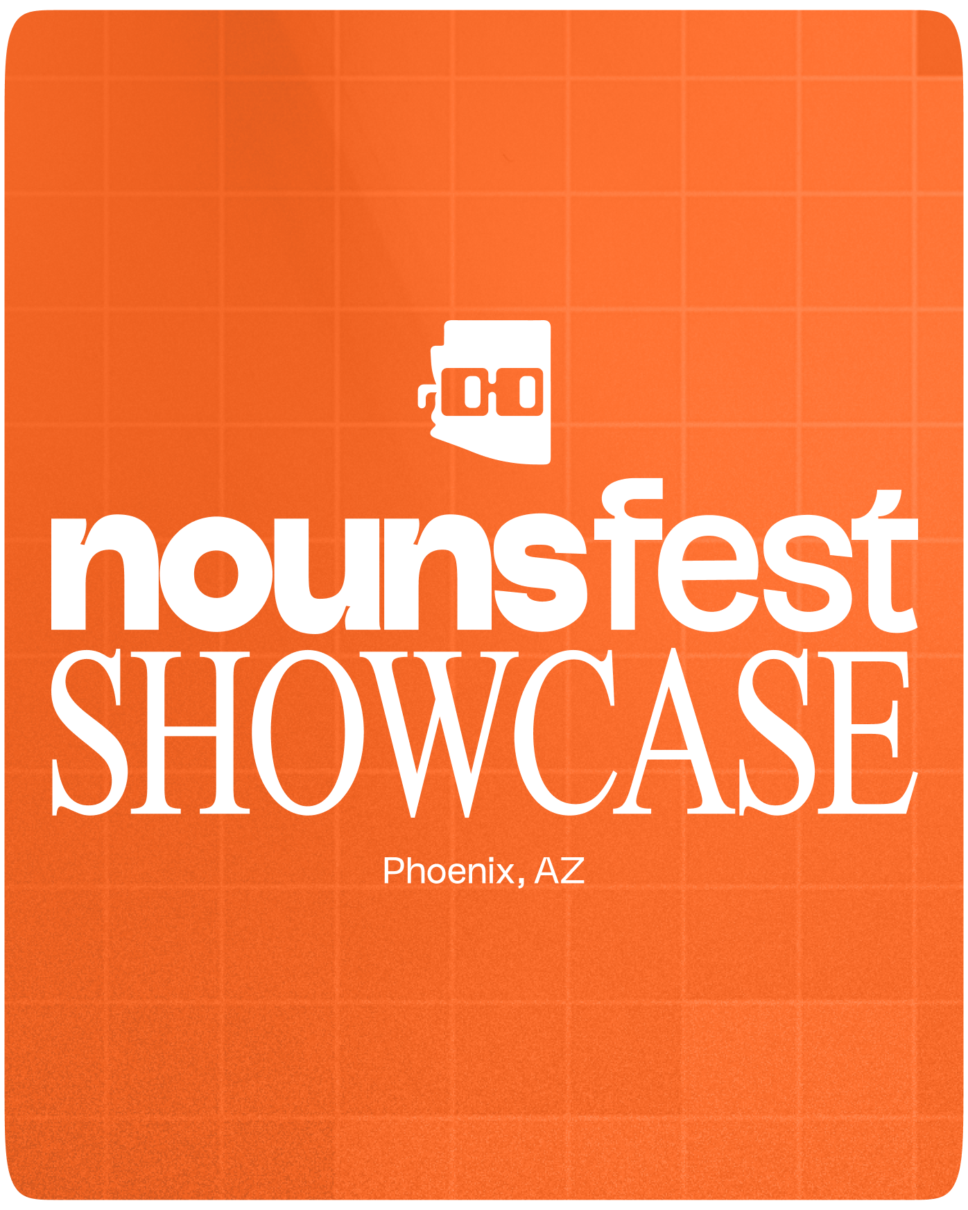
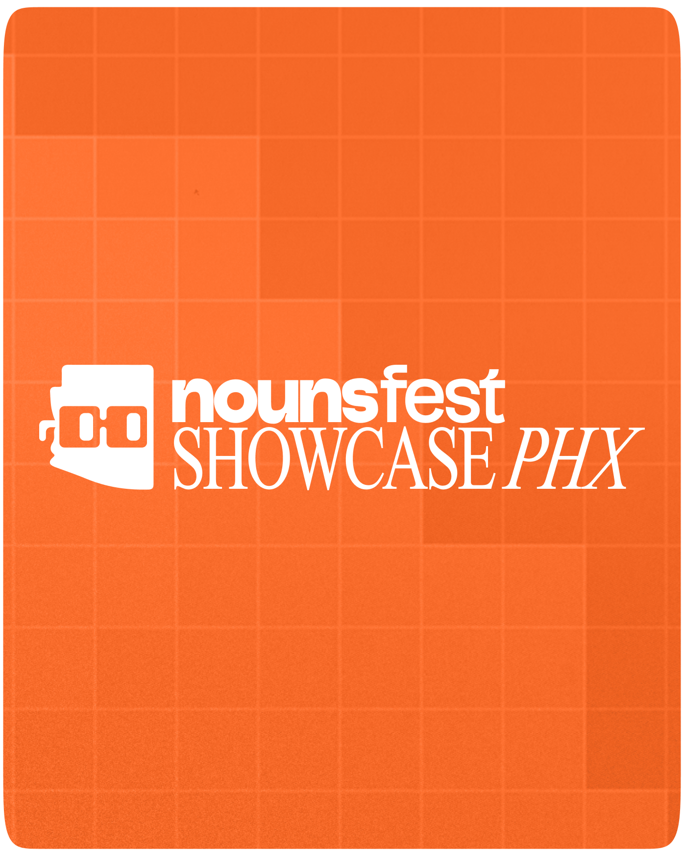
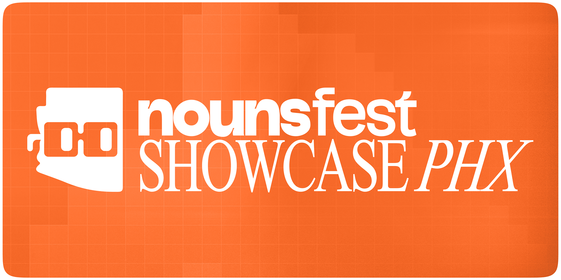
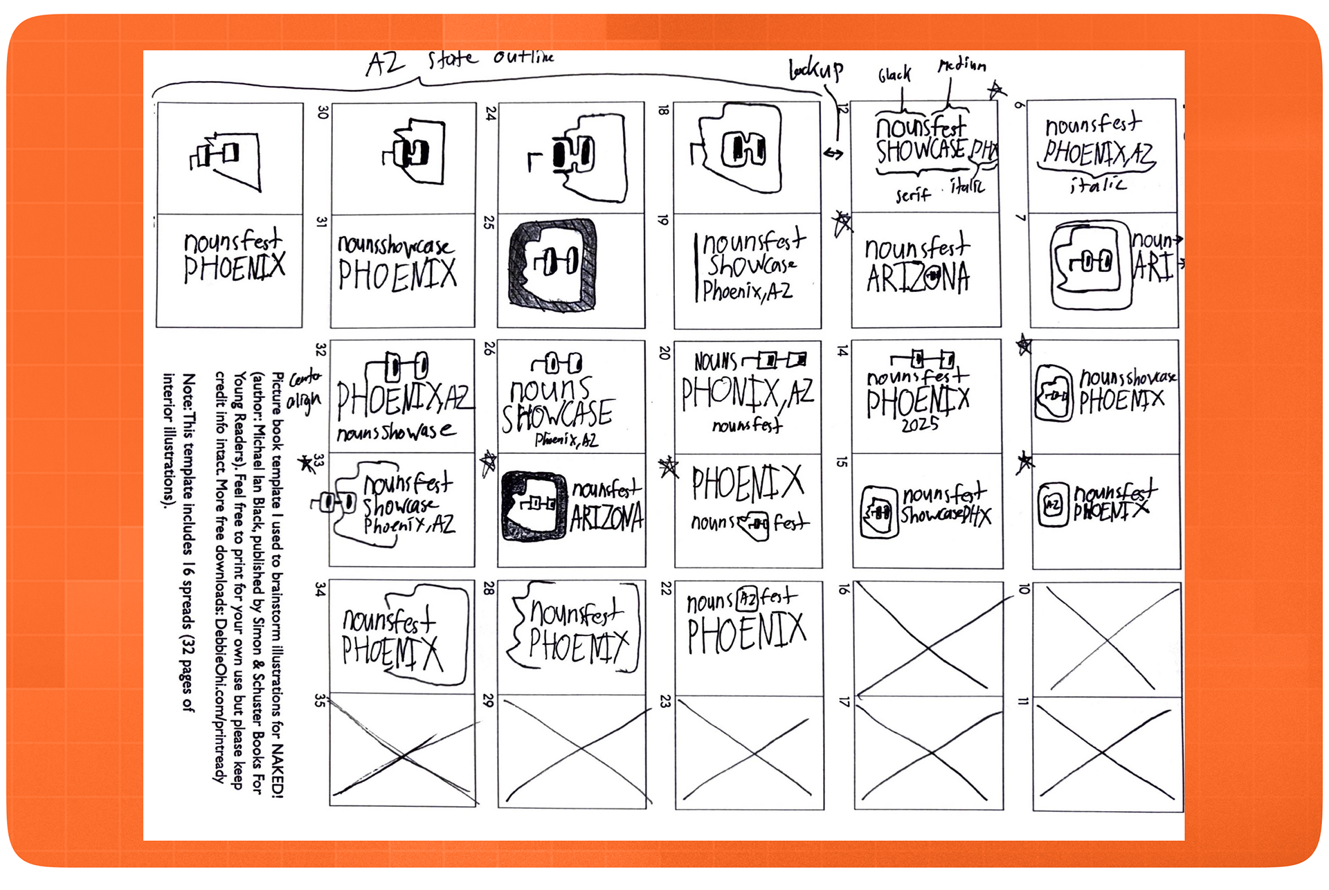
Early on I was figuring out the icon as well as logo layout if it was going to be stacked or side-by-side.

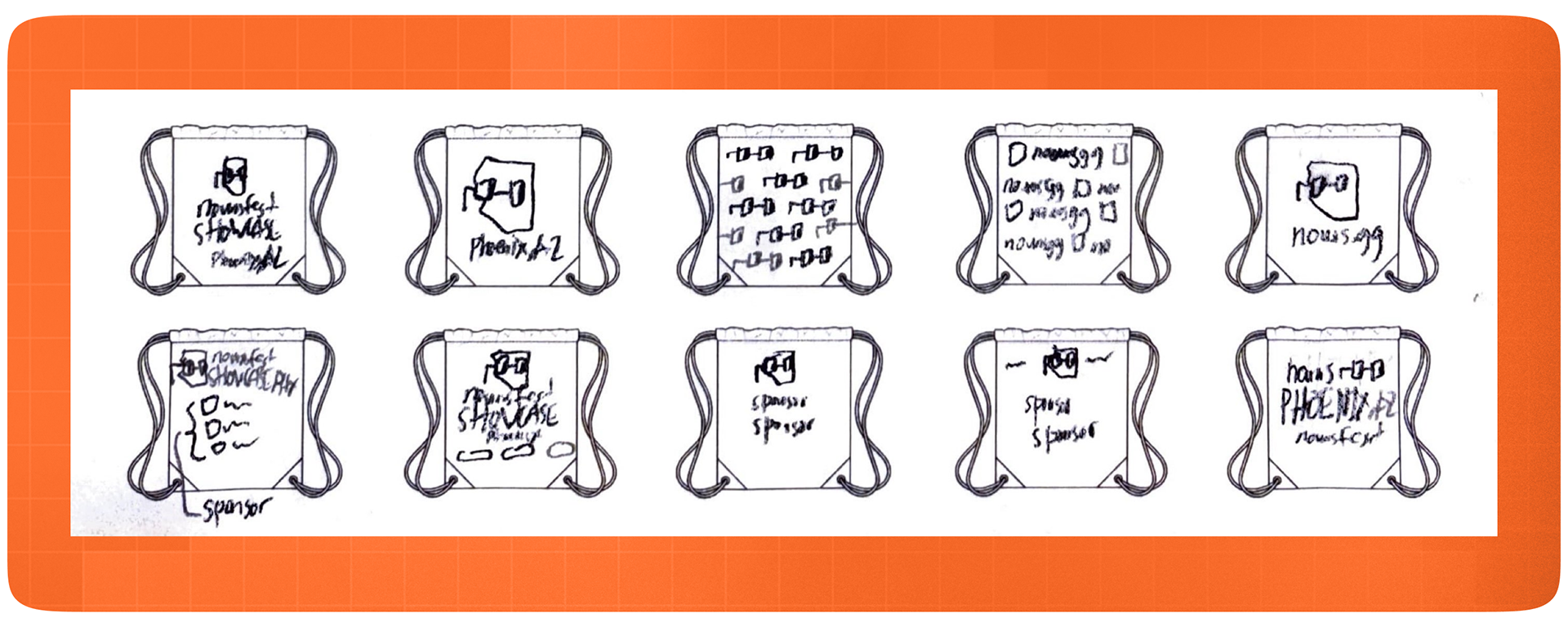
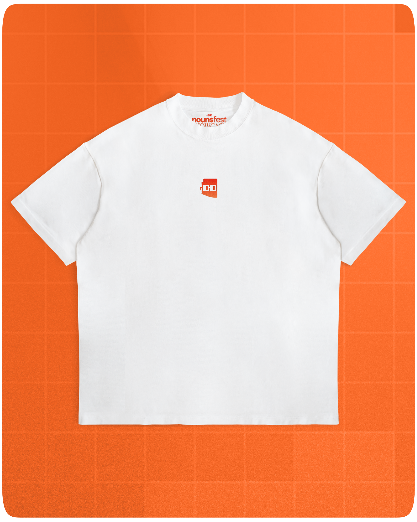
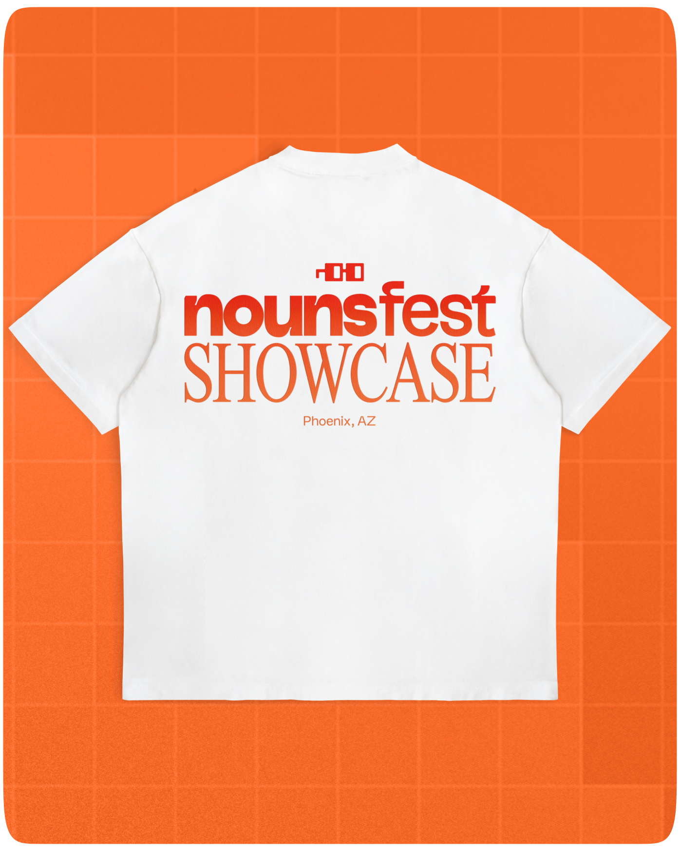
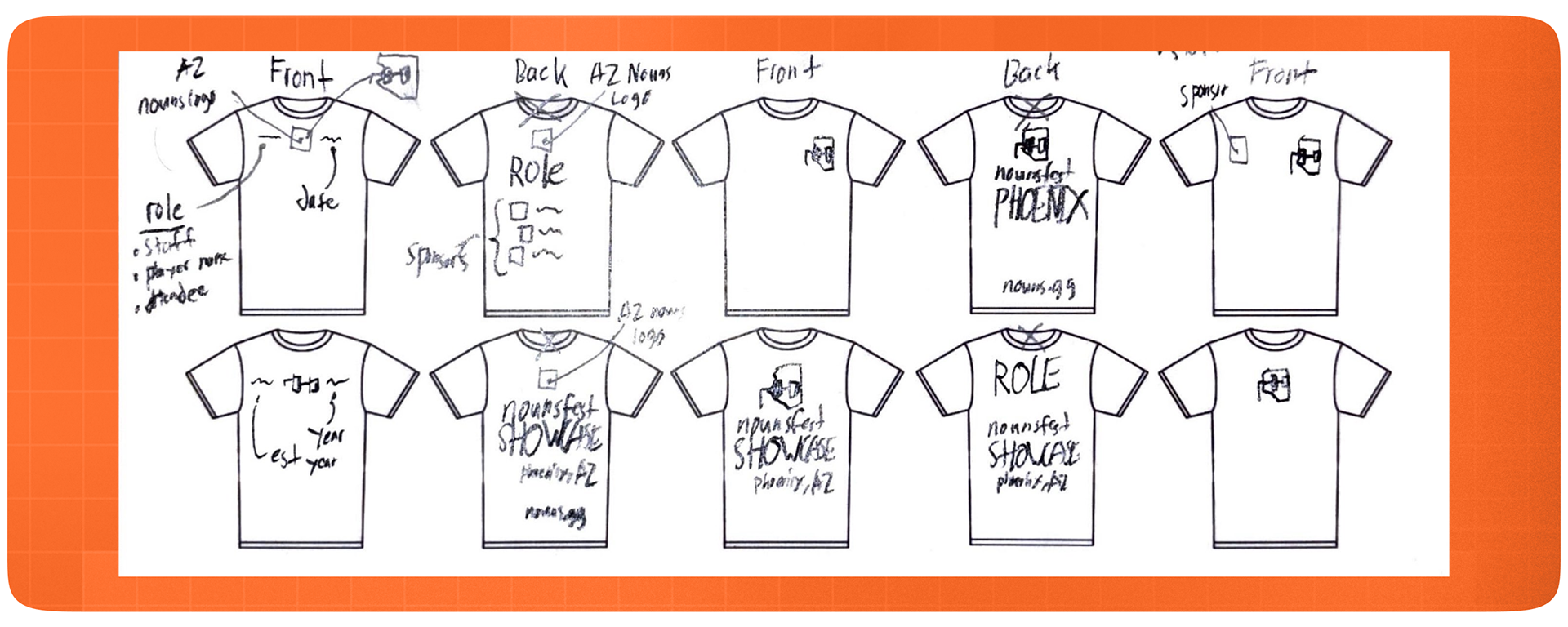
When I was doing thumbnails, I thought about the designs of t-shirts that I normally wear and wanted to reflect that with the final design.

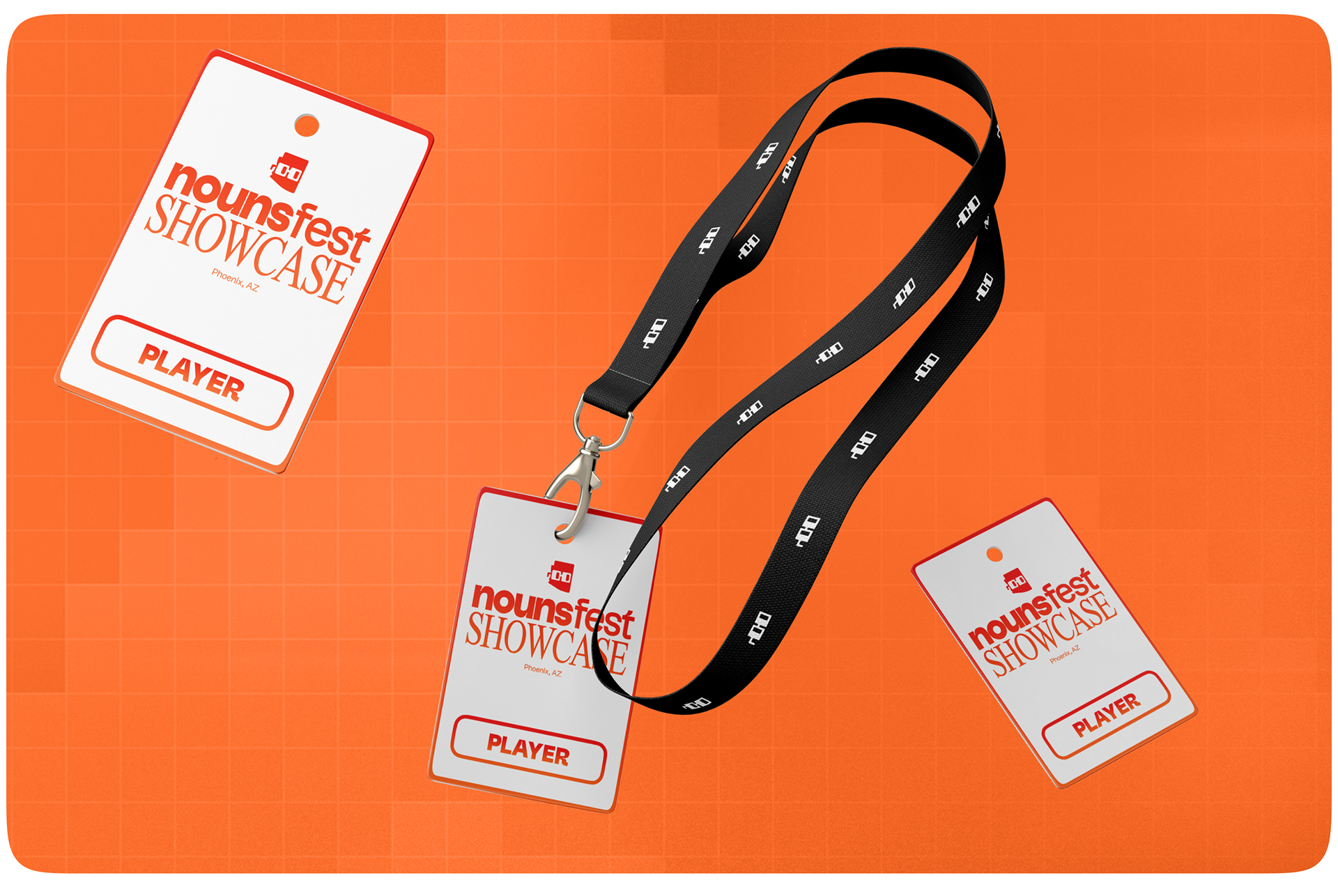
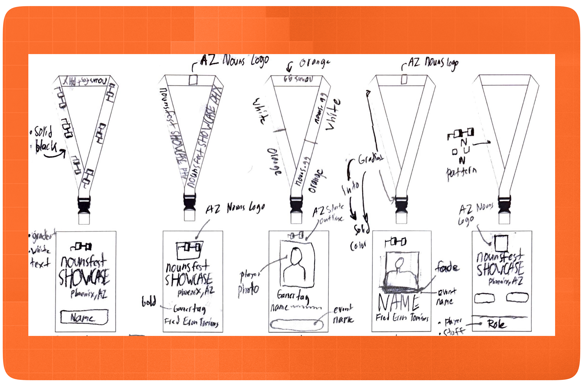
For the lanyards, I wanted to create something that was both minimal but still stood out if seen at a Nouns event. Additionally, as Head TO at GCU Esports, I've always wanted to explore the idea of having player photos on the lanyard itself. This assignment gave me the opportunity to explore those designs as well.

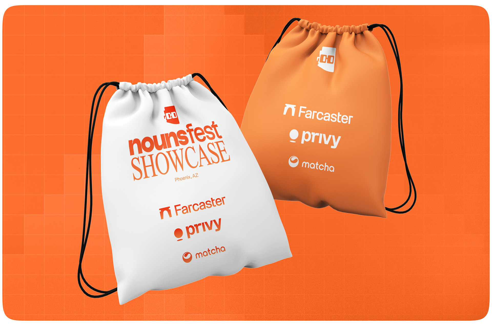
While most drawstring bags are used as free swag, I wanted to create something memorable via creating two separate designs to showcase the orange and white color scheme.